Project Details
Type: Continuous Customer Experience (CX) Research... and Senior Leadership Stakeholder Management
My Role: Lead UX Researcher
Methods Employed: NPS, CSAT, Thematic Coding, Storytelling (via Data Visualization)
Tools used: GetFeedback, Looker, Microsoft Excel, Microsoft PowerPoint, Guru
Project Scope:
I inherited CX reporting at Flexcar after my Research Manager left the company in July 2022, though Senior Leadership Team (SLT) interest in CX reporting piqued in Q1 of 2023. With increased interest, I could focus more time and energy on reporting and analysis improvements - and with them, I encountered two problems:
1) NPS was the most important metric from an SLT standpoint, but for a variety of reasons, NPS was not useful
2) Despite consistent reporting of CX highlights, it was difficult to get teams to mobilize on trends
Throughout the first half of 2023, I led efforts to resolve each of those issues - to mixed success. This page outlines my efforts.
Problem 1: The NPS Question
On weekly and monthly cadences, I reported on Flexcar's Net Promotor Scores (NPS). This reporting was intended to help Senior Leadership understand whether Flexcar's Customer Experience was industry-leading or lagging behind.
NPS is a well-socialized Customer Loyalty metric intended to be comparable across all organizations. For organizations like Flexcar, it could provide false security. 
Imagine that the question on the right asked about Flexcar (instead of Qualtrics), and imagine your friends already own cars, with no need for more. How are you supposed to answer this question?

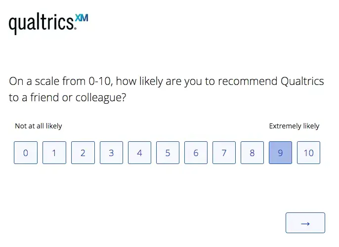
The NPS Question as written in an article published about NPS by Qualtrics.

Flexcar's NPS went down in the last quarter of 2022, so to start 2023, I reviewed over 2000 comments we received in the second half of 2022 and compared those responses to the timeline of changes Flexcar made to its product and service offerings. Two major findings included:
Customers had no idea "how" to answer NPS about our service
The most common complaints were about price, and therefore were not actionable by our Product or Operations teams
When being asked on a weekly cadence about NPS, I found myself repeatedly sharing that I had no insight about the "why" behind large changes in each market's score because of the small sample sizes and large margins of error with the expected weekly cadence.
My manager coached me on Senior Leadership Stakeholder Management while at Flexcar - including that offering research-backed alternative solutions while critiquing current processes demonstrated ownership and was more likely to get buy-in.
Despite oscillating NPS, Customer Satisfaction scores (CSAT) remained stable. I was already running analysis of CSAT data on a weekly cadence to assist Fleet Operations teams. In these meetings with senior leadership, I began pivoting discussion about CX to CSAT scores in each market, as we received more CSAT responses per week than NPS, the margin of error was smaller for equivalent sample sizes, and comments received in CSAT surveys were more actionable than NPS.

An intentionally silly, low-fidelity recreation of conversations with senior leadership about CX metrics

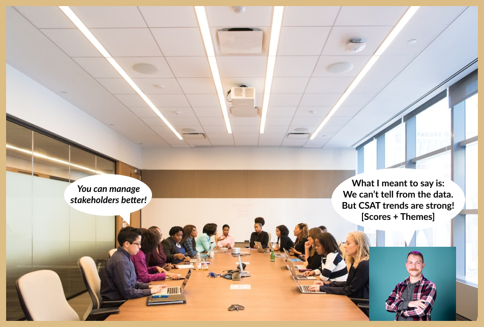
I owe my growth managing senior and C-level stakeholder expectations to my manager's mentorship

With continuous, non-combative, confident sharing about CSAT in moments where NPS provided no usable insight, leadership bought into CSAT being the metric that would provide the best sense of "success" at providing a good Customer Experience.
While I was expected to continue reporting on NPS, I also received buy-in to begin evaluating a "relationship CSAT", asked before NPS in the same short questionnaire. This metric was tied to customer sentiment about Flexcar as a whole, and therefore was more specific than NPS. I was laid off before I could do meaningful exploration of Relationship CSAT responses.
Problem 2: Disconnect between Insight and Action
Toward the end of 2022, my colleague and I created weekly dashboards in Guru including tables of CSAT scores, data visualization indicating top complaints and compliments, and quotes. This was powered by Thematic Coding, or distilling the content of comment responses to its core "theme" to make qualitative data more digestible and analyzable.
Each week, we exported all new CSAT responses from Looker, cleaned the data in Excel so each row contained one response and its relevant metadata, and applied thematic codes in the same rows. This allowed us to create pivot tables and filter by market, Moment of Truth in the customer journey, and more to make relevant charts/gather relevant quotes faster.
Due to competing priorities and my colleague being laid off in Flexcar's First 2023 Reduction in Workforce, I told relevant stakeholders I'd be slowing down dashboard creation - and nobody took issue nor followed up on when they'd come back. 
This set off warning signals for me - if it was a valuable artifact, I'd have expected some pushback. Worse, I feared nobody was using the benchmarks to evaluate the successes or failures of changes to operational standard operating procedures.
As such, I tried giving a monthly presentation to operational leadership, emphasizing places where changes in proportion of comments with specific types of thematic codes were unlikely to be due to sampling error, and providing a statistically confident point of view of the data. I hoped that would increase stakeholder buy-in and lead to productive conversations about the last month and coming month.
Instead, I was met with blank stares and a "hey, that's great! Thanks for your hard work." from team leadership. 
Not fun! But that's the response it deserved - I went too far in the opposite direction from the dashboards.

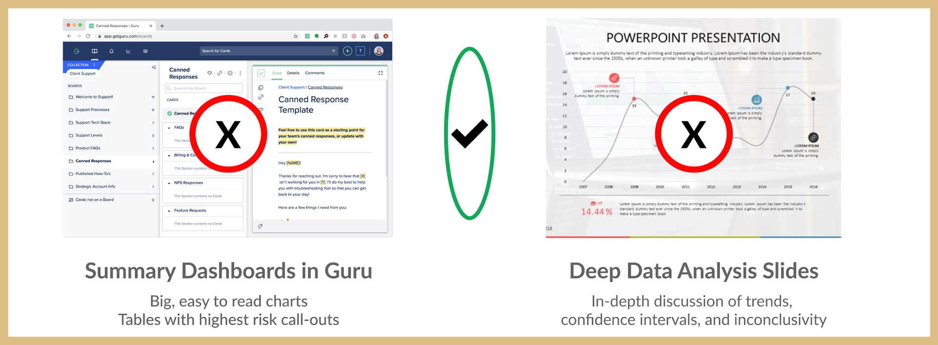
Summary Dashboards in Guru were too vague and lacked a call to action. Deep Data Analysis felt too much like a lecture, sucking the air out of the room for conversation. There had to be a "just right" middle ground.

A middle ground for presenting CSAT findings would need to have the confidence and rigor of my statistical analysis, but it also needed to have the casual nature of the summary dashboards to make conversation easy - and it had to be brief.
Because I had access to all the CSAT responses in a given month including scores and comments, I knew how common certain themes of comments were... and I also knew how often the scores contributed to positive or negative CSAT ratings. By plotting the frequency and severity of certain themes, and keeping the details on each slide vague but easy to read, I hoped to scaffold meaningful and excited conversation.

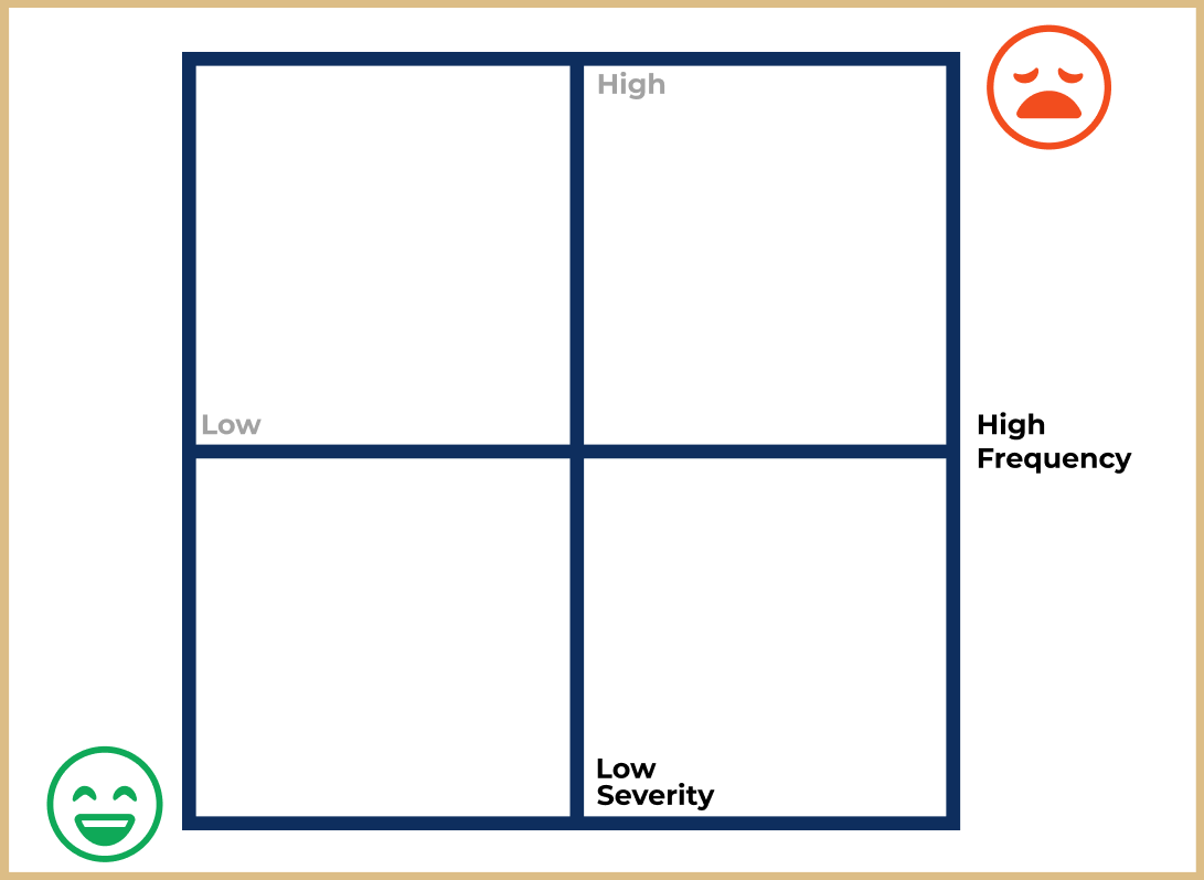
Different themes had different frequencies (horizontal) and severities (vertical). This graphical representation of thematic impact would help argue which themes were important to address.

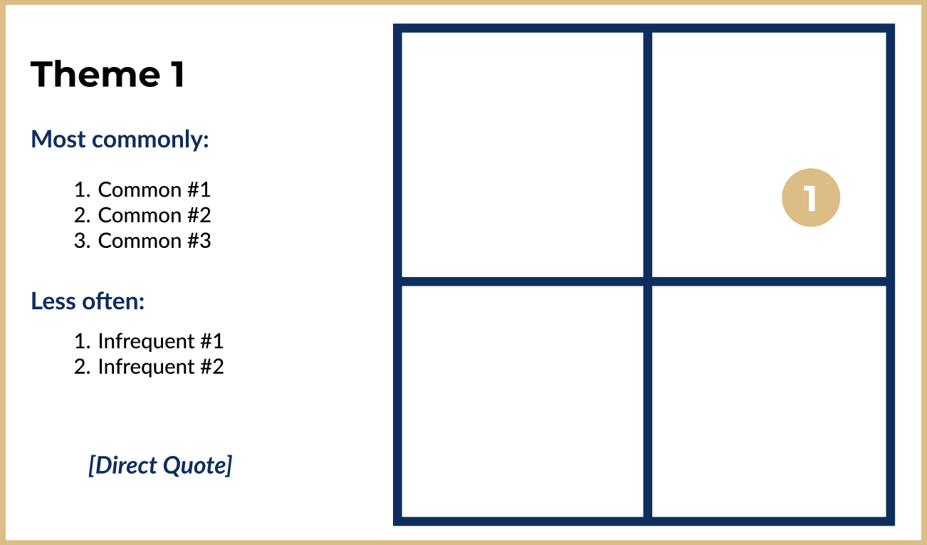
This is an example of one of the slides I presented to Operational Leadership at Flexcar - of course, the themes and quotes were filled in. They're removed for the sake of confidentiality.

Eventually, I had walked Operational Leadership through the top four themes in terms of Frequency - I gave the "what" of the data. Now it was time for the "so what" - and it was my job to convince Operational Leadership that Theme 1 was the most worth focusing on, even though Theme 2 seemed way more severe by the framework I introduced (shown below).
Simple frameworks can be broken for storytelling effect. I was able to keep stakeholder attention high by following the frequency/severity framework while introducing themes... and then revealing that the diagram wasn't to scale.
This subversion of their expectations earned major buy-in to my perspective as a UX Researcher, and it kept leadership engaged enough to discuss the specifics of Theme 1 and how to address specific issues. This allowed my manager's and my one-page write-ups on each thematic issue (including recommended changes to standard operating procedures) to be considered eagerly and, in some cases, immediately put into practice.

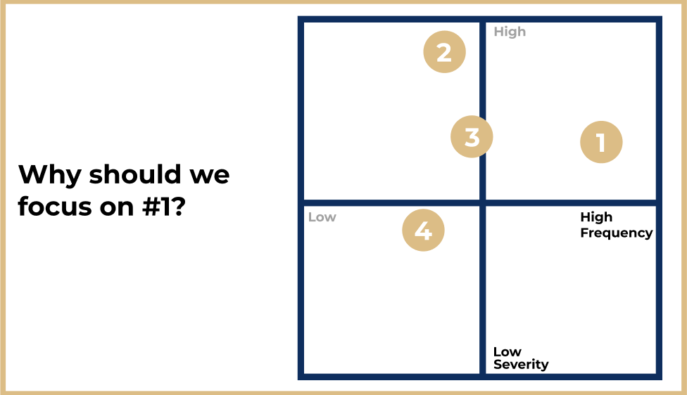
I introduced all four theme-groups in a simplified frequency/severity matrix... but arguments could be made for focusing on Theme 1 or Theme 2. I believed Theme 1 was more impactful.

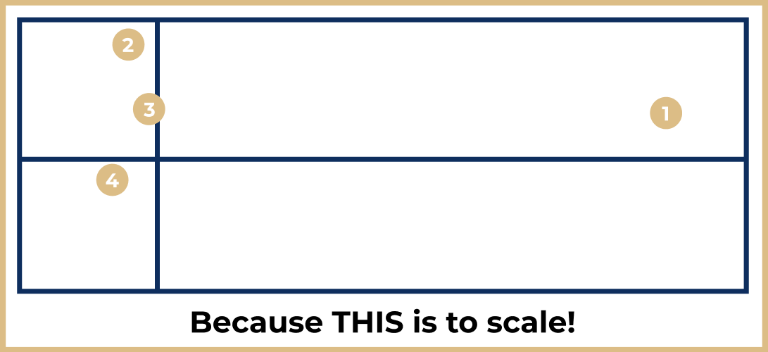
Because I kept the initial framework simple to introduce the concepts, I had the attention of stakeholders. Breaking the framework to make my point took stakeholder interactions from attention to buy-in and trust.

Legacy and Learning
This story doesn't have an ending - at least, not an ending with me. I was laid off as part of Flexcar's second large RIW in 2023. There's much more I would have loved to do, fix, or explore in terms of customer satisfaction reporting, analysis, and outcomes-oriented research.
In April 2023, I realized I misinterpreted some of the data. Flexcar's app was not programmed the way I expected or saw in my GetFeedback Creator Dashboard for each survey, which meant the CSAT surveys fired with different behavior than I expected and was reporting on. I quickly did follow-up analysis to determine the impact of the issue, and there were negligible differences between the original reporting and "cleaned" data - and this realization sparked collaboration between data engineering, app engineering, Fleet Operations, and UX Research.
Following these CX reporting changes and the Data Misinterpretation, I:
1) took a course on Microsoft Excel to improve my efficiency and confidence at analyzing large datasets
2) wrote acceptance criteria for fixes to Flexcar's app to make CSAT surveys fire when they were intended to - and collaborated with engineering teams to ensure those fixes went live
3) focused almost exclusively on exploratory research about Flexcar's users after we changed our pricing model
I would have liked to see how much changes to Flexcar's Fleet Ops SOP's... fueled by my manager's and my recommendations... impacted customer experience in qualitative and quantitative ways.
Despite not having a clear ending, I grew out of imposter syndrome doing quantitative UX Research, improved my ability to clean and automate analysis of quantitative data, and grew in my ability to communicate effectively with Senior-level stakeholders.
Back to Top