Project Details:
​​​​​​​Type: Accessibility-focused UX Research and Design contract between NYU Ability Lab and NYC Media Lab
Team: Two project leads, six graduate student researchers and designers, two undergraduate junior researchers
My Role: Junior UX Researcher
Methods: Literature Review | Moderated Usability Testing | User Interviewing | Rapid Prototyping
Project Summary:
Acknowledging that nearly 40 million Americans live with some form of disability, Charter Spectrum wanted to increase the accessibility of its home entertainment products. Despite meeting some of WCAG 2.1’s success criteria, Spectrum’s products were difficult to use for customers with a variety of disabilities.
As a part of a research team at NYU’s Ability Lab, I was asked to conduct research to humanize access issues, identify gaps in Spectrum’s home entertainment apps’ usability, and prototype solutions to accessibility issues to help Spectrum better meet the needs of all its users.​​​​​​​

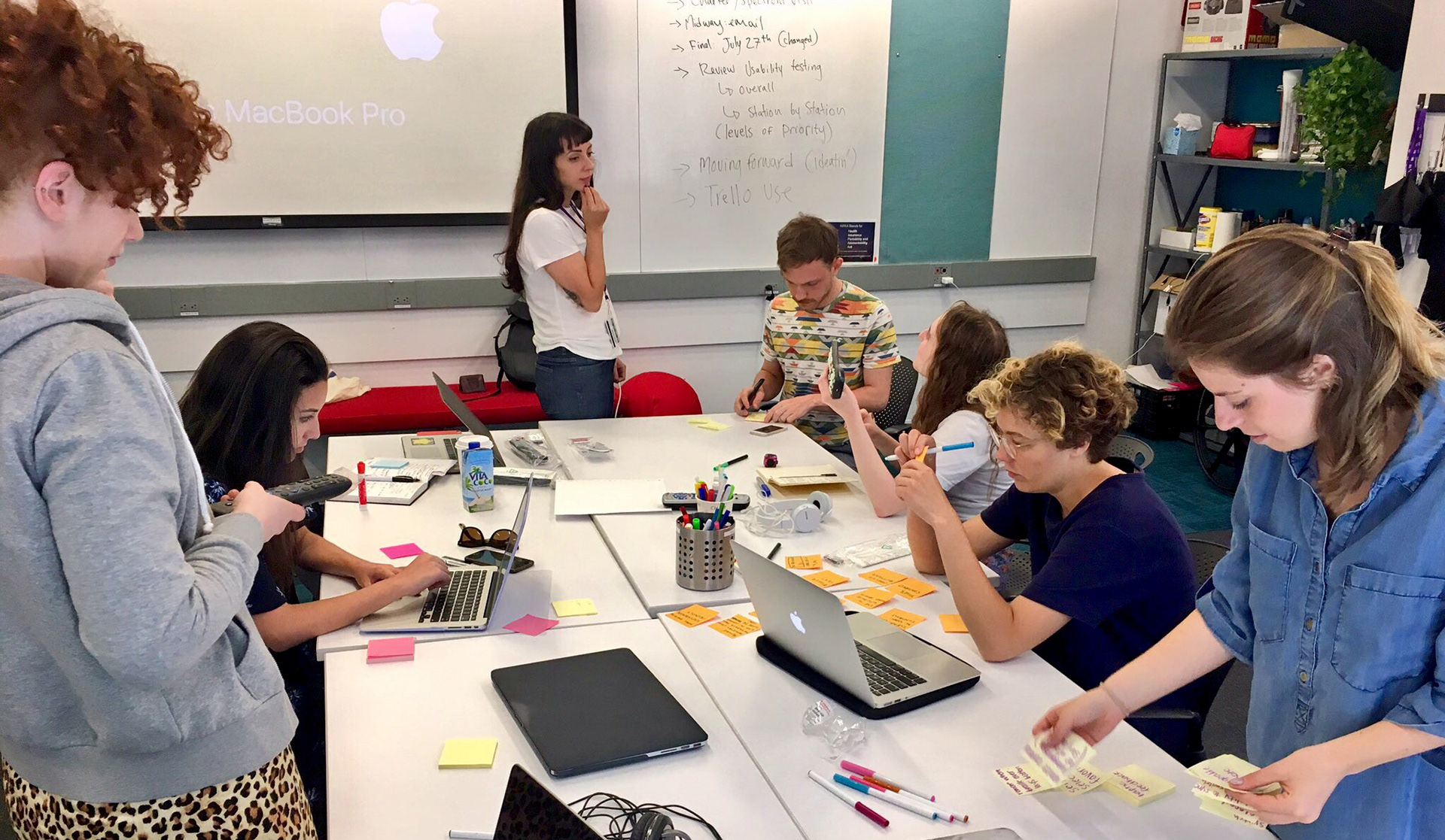
The NYU Ability Lab x Charter Spectrum research team brainstorming about UX and accessibility early in the project

Running Usability Tests
I conducted usability tests of Charter Spectrum's home entertainment app for the Xbox One platform. With a think-aloud protocol, I was able to learn what points frustrated or confused users as they came up. While a traditional test in this style includes minimal-to-no input from the researcher, I bent the rules when asked by Blind participants to describe what was on the screen. 
In the case when a Blind participant asked me what was on the screen, I asked them to describe how they thought their inputs affected the app, and then after making note, I described the actual state of the app. This was an accommodation I made out of respect for any participants who wanted to continue with the task analysis even when they did not receive enough feedback from the app to know how to progress.

Usability Test Details
Number of Participants: 10
Style: 10-15 minute task analysis, 5 minute interview
Some examples of tasks included:
•  Find any specific channel (Prompt if asked: Find CNN)
•  Find your favorite TV show
•  Determine whether [whatever TV show is on] is On Demand or Live TV
•  Adjust the volume:
a) Turn all the way down, b) then back up, c) mute, and d) unmute

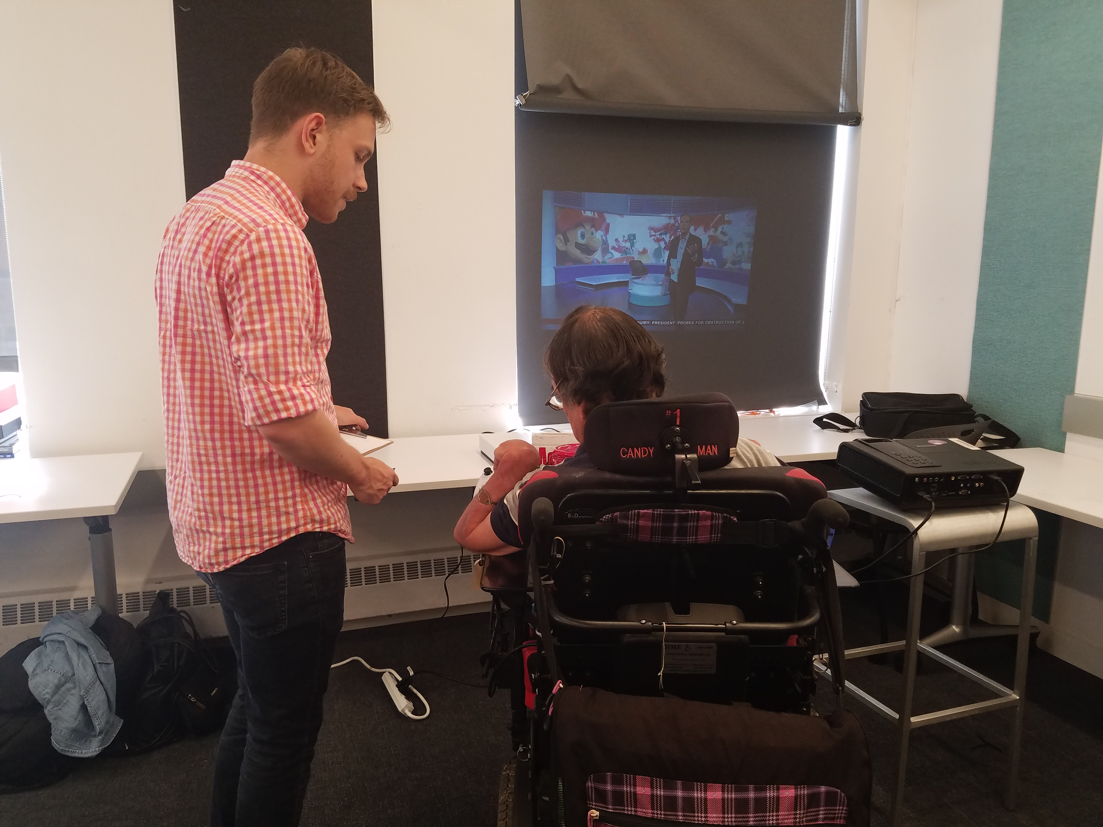
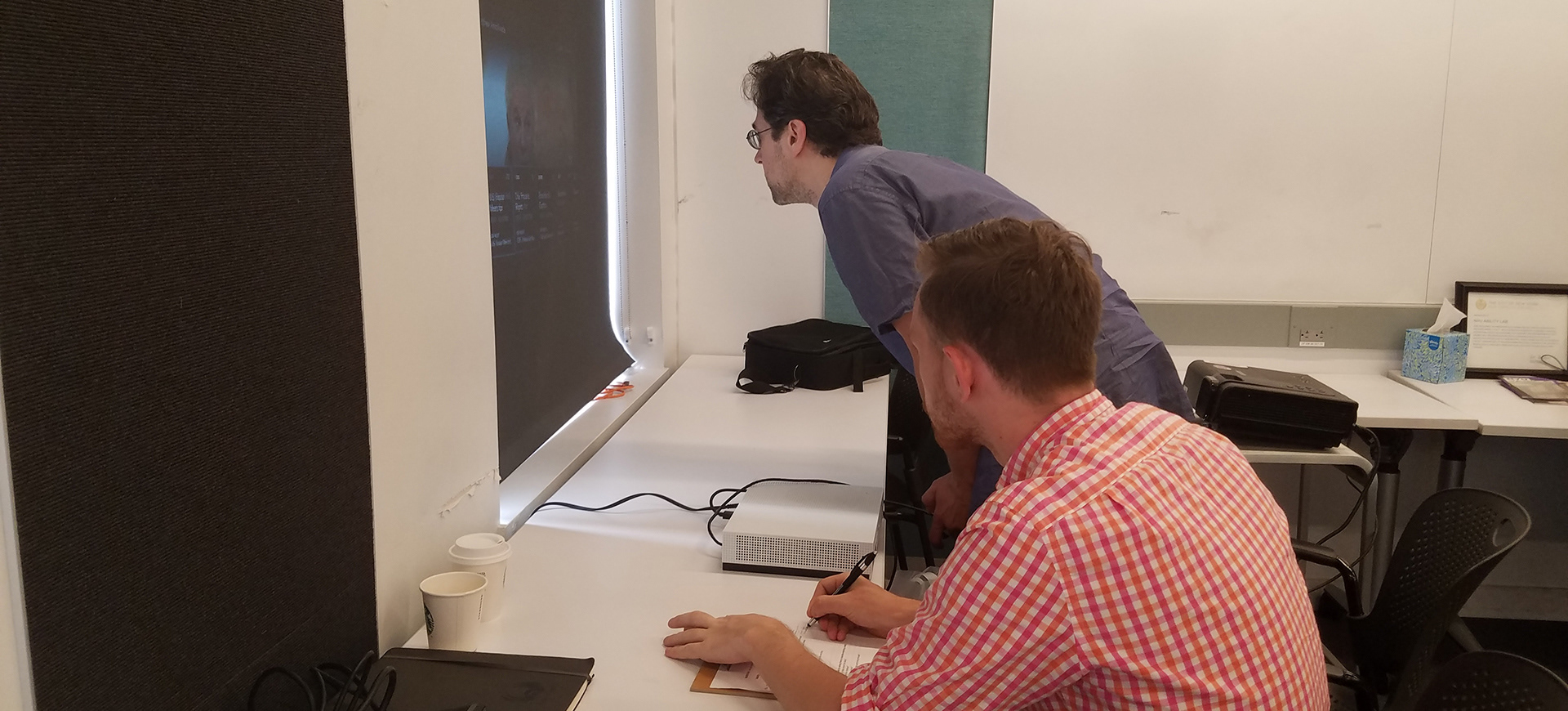
Some participants used power chairs and had limited dexterity, making Xbox One controller-usage difficult

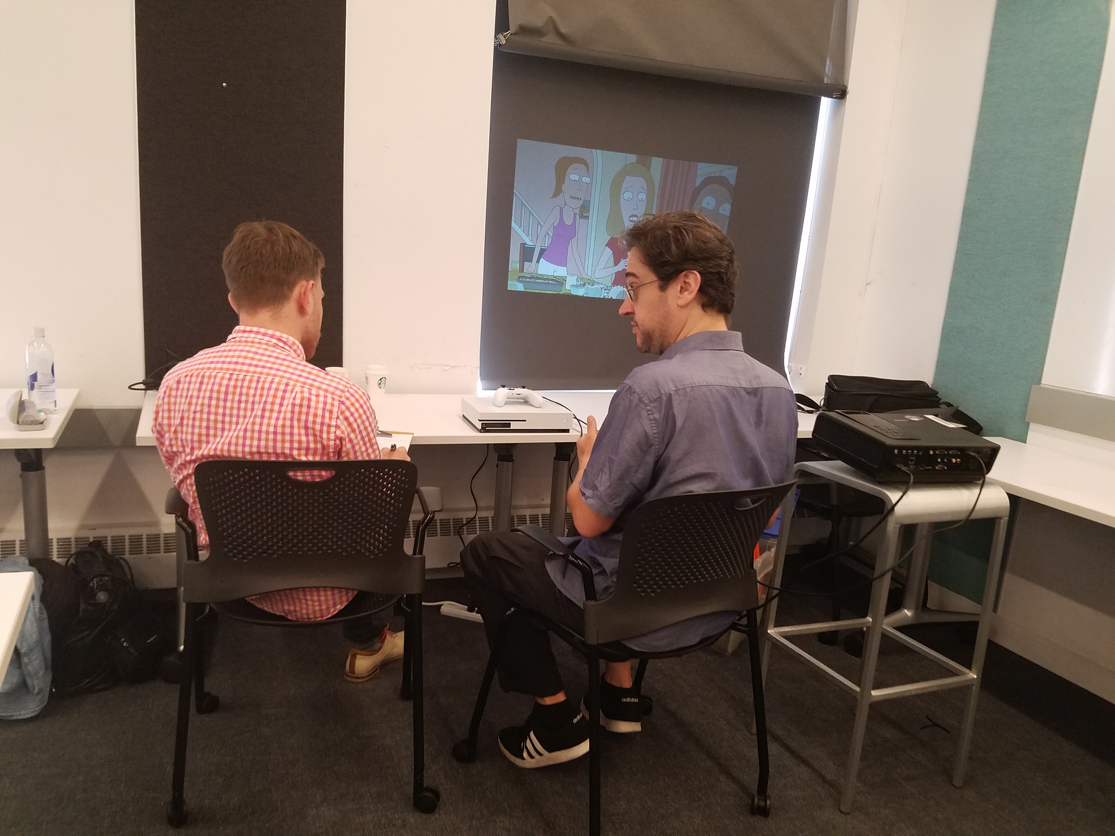
Blind and Low-vision participants had difficulty with the Xbox One app due to lack of feedback and contrast, respectively


Findings from my tests of the Xbox One app included:
        •  Interactions lacked any sense of feedforward - participants could not predict how to access menus
        •  Xbox Narrator mode compatibility and described video options were entirely absent
        •  There was no in-app onboarding for first-time app users
        •  When using the Xbox One controller, there was no audio nor vibrational feedback for inputs

A recreation of the interactions a Blind participant took when testing the Xbox One controller - receiving no feedback, she did not know she had caused any menus to appear, let alone the search

An example of Spectrum's iPad interface at the time

When synthesizing findings across platforms, my team found universal concerns:
•. The user interfaces differed completely across platforms
•  Menus often were too low-contrast to easily distinguish from backgrounds
•  Interaction with remotes is difficult without certain levels of dexterity in one or both hands
•  Screen-reader software, when usable, hit dead ends due to inaccessible code
Designing Prototypes for a Second Round of Usability Testing
Our team took feedback from all users’ experiences across applications and set about creating prototype solutions ranging from the immediately possible to more blue-sky, 10-years-from-now solutions. From my research with the largely unusable Xbox One app and from the synthesis of other platforms' usability issues, I recommended improvements to the Graphical User-Interface (GUI) as well as an HTML prototype which designers on our team created before a second round of usability testing.
The GUI prototype was higher contrast than Spectrum’s apps to make content easier to read and find, we simplified the menu to make the search more prominent, and we included sections for “featured content” and “continue watching” to make popular content easier to find. The HTML prototype did not include any multimedia, but we created it with semantic HTML to improve screenreader compatibility.

About half of the participants in the second round of usability testing had tested our first round as well,
allowing them to compare across experiences and share successes and failures within our prototype

Apple Voiceover users found our information architecture was easy to navigate and straightforward,
but JAWS users found the HTML prototype usable, but it did not cater to the strengths of the screenreader.

Reflection
The team with which I worked used a deck to demonstrate our findings and recommendations to Charter Spectrum and to NYC Media Lab. Importantly, we were able to share quotes and videos gathered throughout research to demonstrate a human impact beyond "usage data".
Our work had impact because our participants felt a sense of validation and support when contributing to our research that they rarely felt when interacting with home entertainment software - simply having their frustrations heard mattered. I take the stance that advocacy through design research is valuable even when the outcomes are minimal.​​​​​​​
Back to Top