Project Details:
Type: 1 month project with two phases
My Role: Lead UX Researcher
Methods Employed: SUPR-Q | Unmoderated User Testing | Thematic Clustering
Tools used: Surveymonkey | UserTesting | Dovetail
Project Scope:
VP Transform is a Digital Therapeutics product within Virgin Pulse that initially focused explicitly on Pre-Diabetes maintenance using educational materials, metric-tracking, and coaching to improve health outcomes. While I was employed at VP, Transform was a standalone app.
I was asked to help the Product Team decide which feature-set/vertical was in the greatest need of a revamp, as anecdotal feedback indicated the app didn't feel "modern enough".
Because there were no quantitative benchmarks of satisfaction or performance, I took a step back to "diagnose" a problem prior to giving recommendations - and the recommendations I ended up giving completely challenged the Product Team's assumptions for the better.

VP Transform's current design (clay-model) image visible on its page on Virgin Pulse's website
Using SUPR-Q as a quantitative benchmark
Standardized User Experience Percentile Rank Questionnaire (SUPR-Q) is a tool that quantitatively evaluates four attributes of a website's UX: Usability, Trust, Loyalty, and Appearance. I chose to use SUPR-Q over other questionnaires because:
1) The Research Objective of 'helping Transform feel more "modern"' was too vague to be actionable, whereas I hoped the four SUPR-Q Attributes would offer more direction
2) SUPR-Q asked fewer questions than SUS or WAMMI - other website evaluation questionnaires I considered
3) Virgin Pulse's main app used SUPR-Q for benchmarking, allowing for relevant goal-setting and comparison
SUPR-Q Findings: An issue of Loyalty
After 90 former VP Transform users completed the SUPR-Q, I examined the scores, standard deviations, and deviations when compared to the main Virgin Pulse app's scores.
While "usability" and "appearance" were unremarkably fine scores, "trust" scored particularly well, and "loyalty" scored especially low. Because the NPS question contributes to a fraction of the loyalty score, I reviewed the raw data and found an NPS score 35 points lower than Virgin Pulse's main app's score.
This concept of "loyalty" and low likelihood to recommend VP Transform informed my future analysis - and future analysis it needed! SUPR-Q can help point out problems, but it does nothing to explore root causes. Qualitative follow-up research was critical.
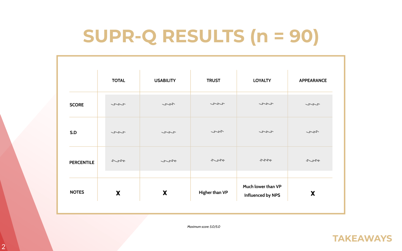
Metrics removed for using Figma's "Redacted Script" font. Slide taken from my read-out on this study.
Follow-up Research: Unmoderated User Testing
Because I was Virgin Pulse's solo UX Researcher for 12 product delivery teams, I lacked the capacity to do moderated follow-up research. UserTesting's unmoderated testing tools allowed me to gather valuable data while conducting research for other teams.
I offered a reward for five randomly-selected VP Transform users who were toward the end of their program in return for completing the unmoderated test. I sent each participant a video tutorial to help them use UserTesting more comfortably, and then granted access to the 13-task study.
Tasks included think-aloud activities while using the app in specific ways and open-ended questions about recent experiences and positive and negative memorable experiences. Participants recorded their screen while talking aloud, resulting in about an hour of footage to analyze.
The most surprising and impactful insights had little to do with visual design or interaction design:
App Performance harmed loyalty and motivation
The majority of ALL comments about specific features within VP transform were negative - but the negativity was not based in how "modern" the feature felt. Particularly, participants were frustrated with app performance issues: data visualization not showing up, issues syncing smart devices to the app, and progress not saving.
When participants had consistent issues uploading data or completing text prompts, making "progress" in the app was more difficult than it needed to be. Because app performance was volatile and unpredictable, it felt like a waste of time to use the app, and multiple participants quit the program early... which seemed to align to the lack of "loyalty" seen in SUPR-Q testing. Quitting early caused other problems, too:

Social experiences aren't for everyone
VP Transform used "participant cohorts" to Users would be in groups while going through the Transform Program, and they'd be required to interact in group forums to get progress at certain points in the program.
Some participants felt their health was a private, personal issue, and were unmotivated by what felt like extraneous interactions/hurdles to taking care of their health. Additionally, all participants indicated at least some frustration by the lack of participation from lots of members in their cohorts - either due to people dropping out or putting in minimal effort. This decreased the value of the coaching and total program, especially when more feature-rich platforms existed for individual health needs and health tracking (such as Fitbit and Samsung Health).
Impact and takeaways
These insights challenged the initial team assumptions that a "modern experience" could be created purely from changes to the UX, visual design, and interaction design. The social dynamic of the app deserved to be revisited, but when giving a primary recommendation, I encouraged the team to put more resources into platform engineering improvements than UX to start.
I know the team roadmapped those improvements and even brought VP Transform from a standalone platform into VP's core platform to improve its performance and reliability. Work was defined and placed into sprints beginning the month I left the company (to begin work at Flexcar), and my research helped prioritize that work sooner than it was originally slotted. I encouraged the team to continue benchmarking using the same SUPR-Q survey once per year or two months after any major release, whichever came more frequently.